SwiftPay
A personal project in the financial sector focused on facilitating banking transactions.
What are we try to solve?
Operation managers in banks perform financial transactions daily.
Systems of this kind need to present data clearly, enabling users to quickly understand the information in graphs at a glance.
Additionally, the system should display data in a table with status indicators and the ability to edit, allowing transactions to be carried out more efficiently.
The Main Persona

Key Challenges
Data Complexity
Challenge: Presenting large volumes of data clearly.
Solution: Use visualizations like graphs and icons for easier interpretation.
1
Real-time Data
Challenge: Displaying live data without delays.
Solution: Provide real-time updates with minimal delay.
3
User Experience
Challenge: Ensuring the dashboard is intuitive for all users.
Solution: Simple, clean design with easy navigation.
2
Customization
Challenge: Allowing users to personalize the dashboard.
Solution: Enable customization with filters and adjustable fields.
4
Competitors

Proposed Solution
1
Dashboard Purpose:
-
Provides an overview of matching records, transaction failures, and performance trends
Features- Key Results:
2
-
Pie Chart (Buy vs. Sell): Displays the ratio of buy vs. sell transactions
-
Bar Chart (Transaction Value by Date): Shows total transaction value by date
-
Bar Chart (Match Percentage by Date): Tracks the percentage of matched transactions over time.
User Flow

Wireframe
-
Dashboard: Displays graphs with filters for date, client, currency, and adjustments, with the option to filter within the graphs.
-
Table View: Includes free, regular, and advanced search options
The design allows:
-
Quick identification of issues at a glance and real-time data visibility.
-
Users to edit data, expand rows, and add important documents and evidence.

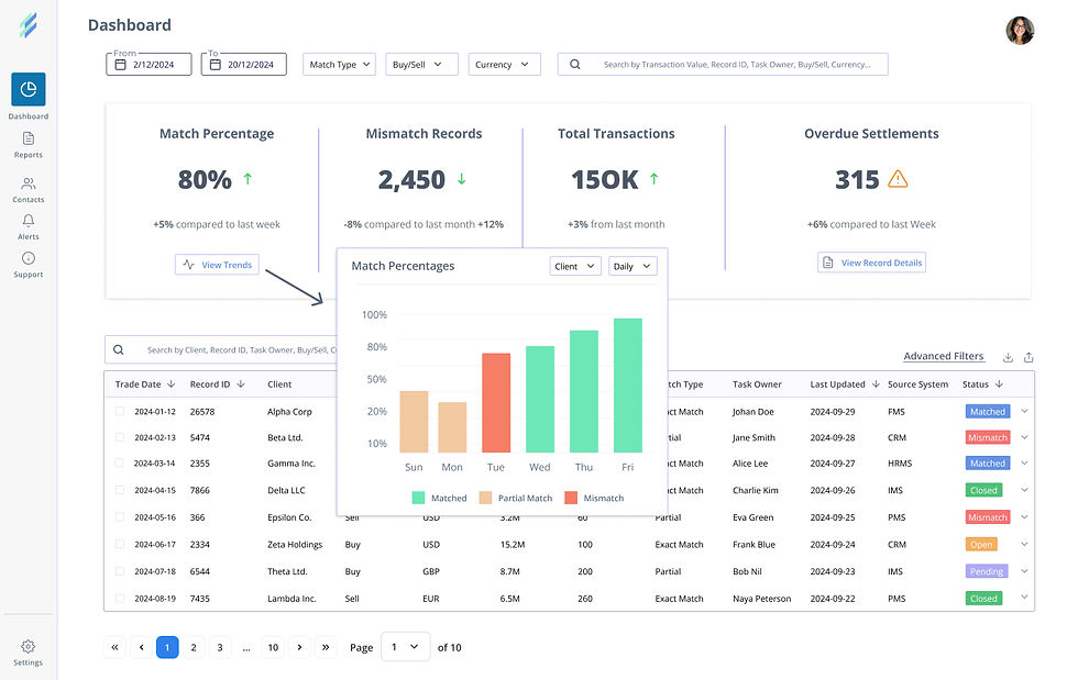
UI Design- Option 1
The first option presents the graphs in a visually appealing way, allowing quick identification of issues at a glance.
However, it feels overloaded, which is why I considered an alternative approach.


UI Design- Option 2
The second option displays cards with important data, providing insights, including comparisons to specific periods, offering immediate information. It presents a cleaner and more streamlined design.
Additionally, a graph can be displayed by clicking a CTA button within each card.